Knocking it out-of-home
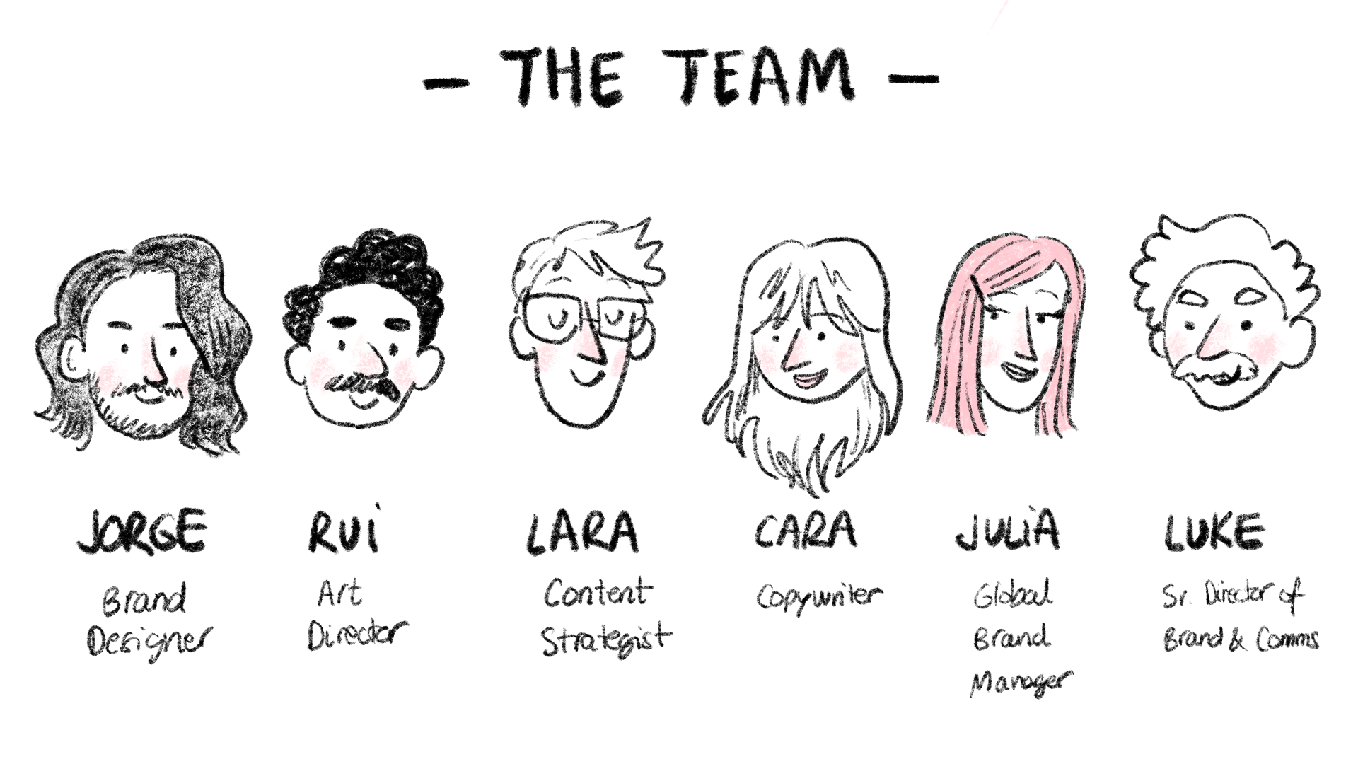
︎ by Jorge Garcia , Senior Brand Designer
First of all, let me tell you that, if you’re here wanting to find a super polished, straightforward, and accomplished case study about the perfect ad campaign, it’s best to stop reading here. Creative work is always messy, especially when it’s a multi-disciplinary team effort. As much as I love seeing case studies out there that make everything look seamless, I know for a fact that things rarely work that way. But that’s part of the beauty. Welcome to the madness.
![]()
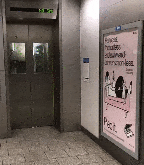
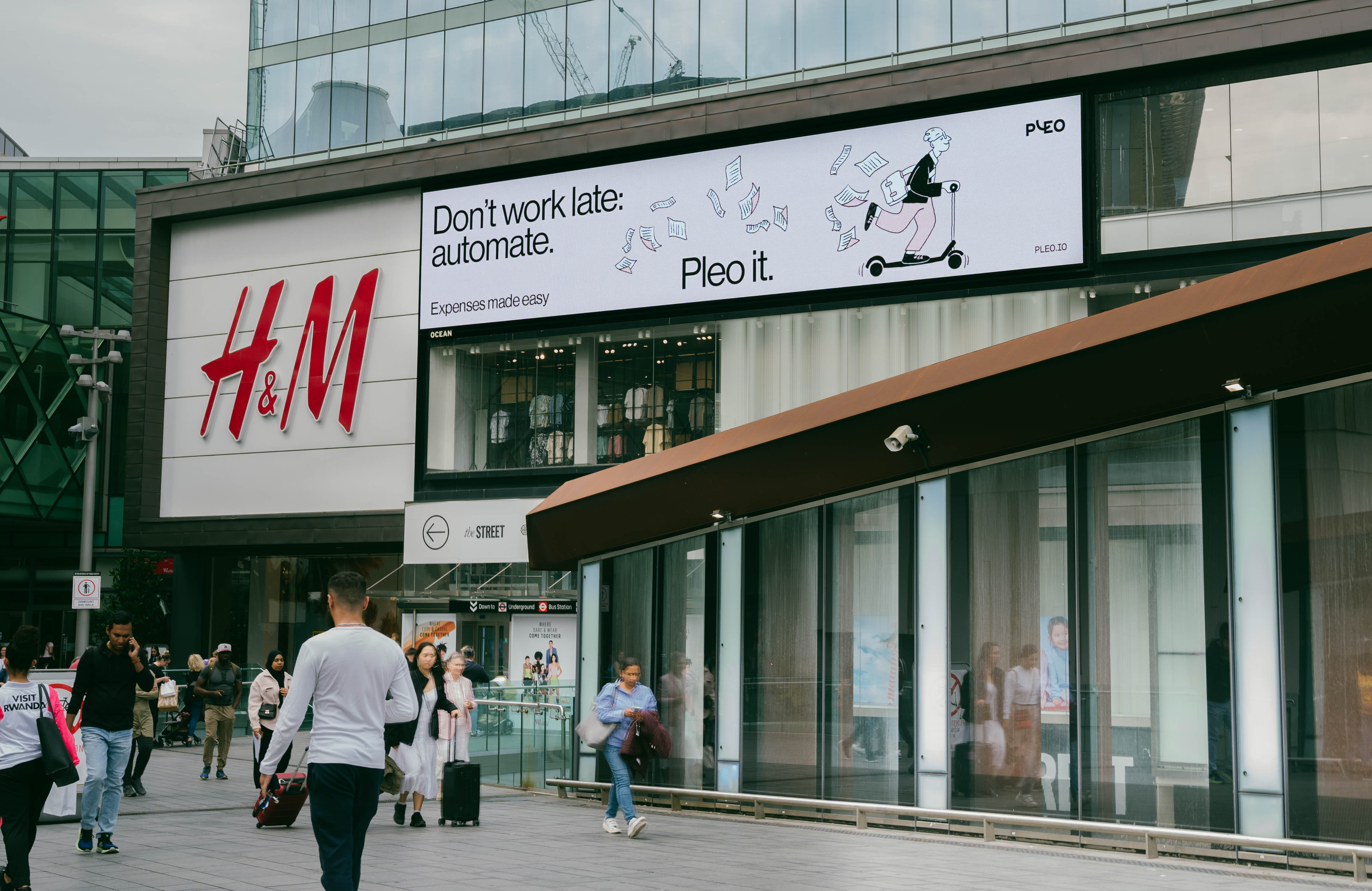
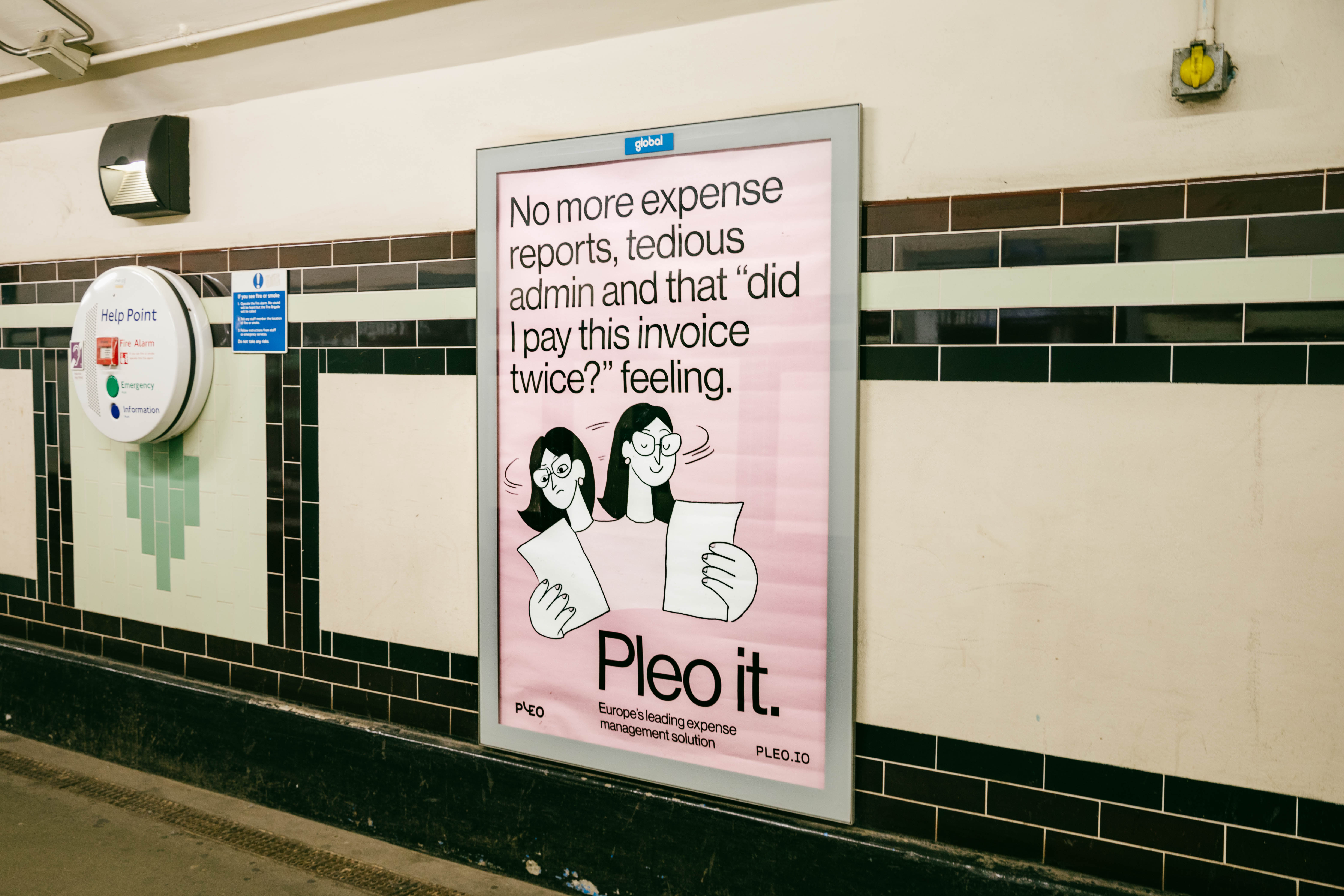
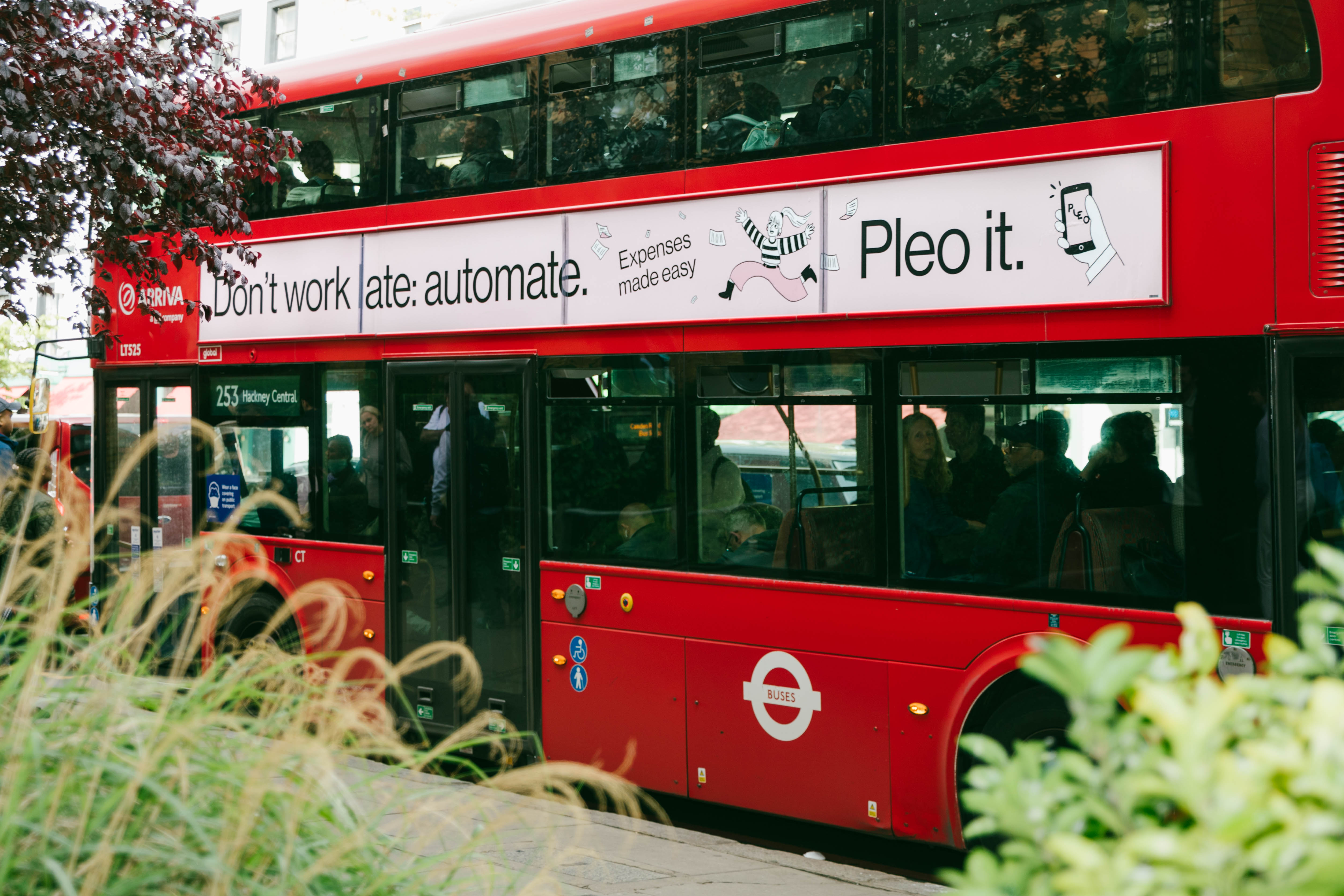
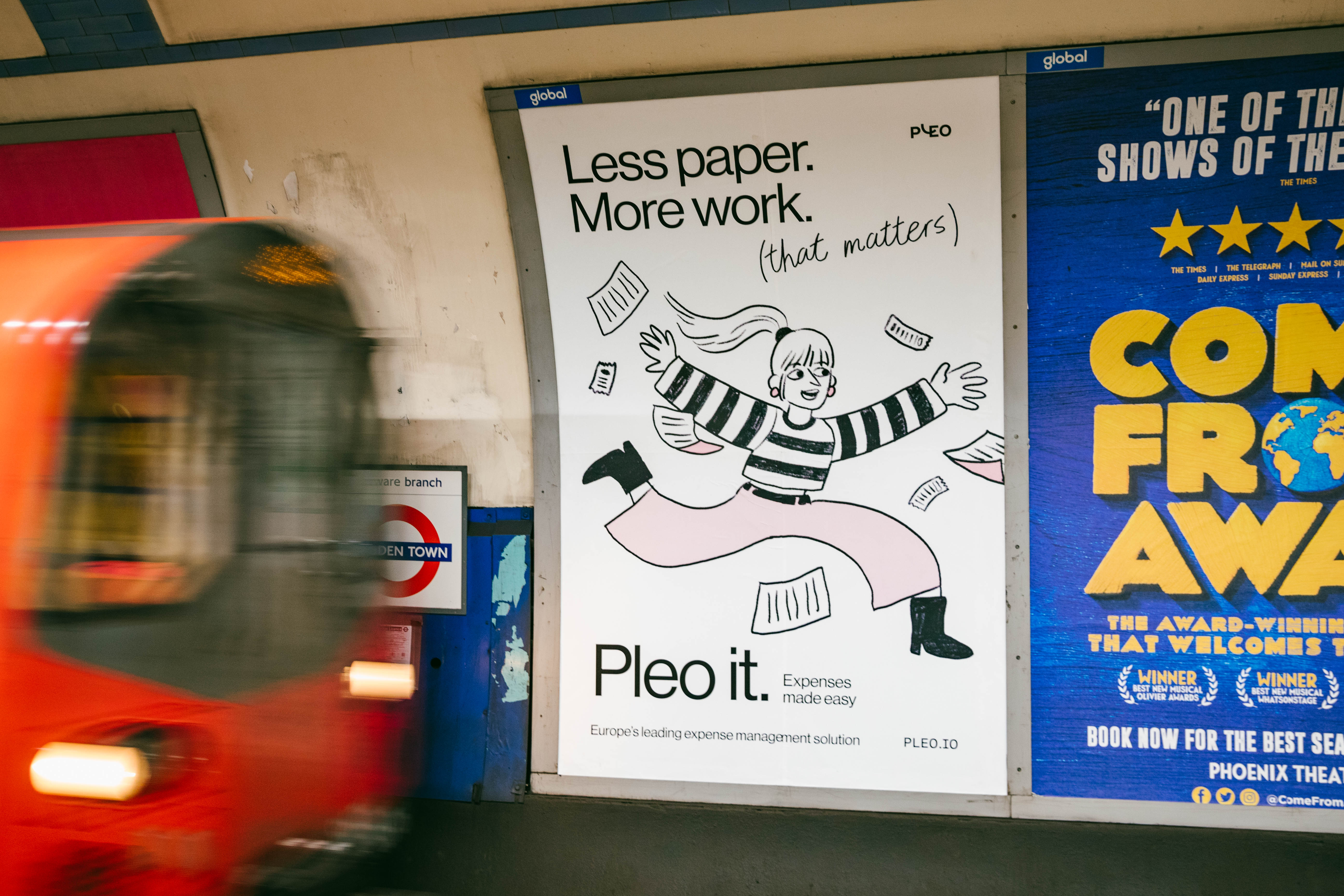
After our first ever out-of-home (OOH) campaign in 2021 around our East London office, it was time to double-down and paint the London town (Pleo) pink. Both exciting and scary, but we’re here for the ride.
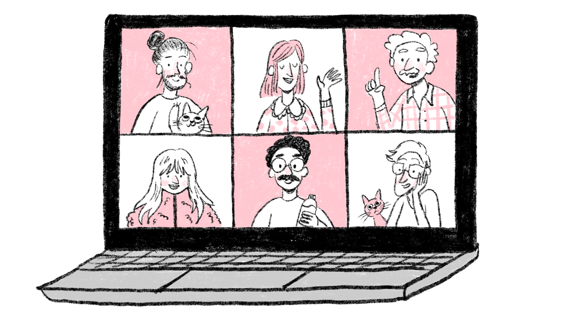
Fortunately our Global Brand Manager at Pleo had planned some very useful workshops to kick-off the daunting project, which personally helped me a lot since I have this annoying tendency of getting ahead of myself and start thinking about the visuals right away — lesson number one: an effective advertising campaign needs to be more than a good looking poster.
Fortunately our Global Brand Manager at Pleo had planned some very useful workshops to kick-off the daunting project, which personally helped me a lot since I have this annoying tendency of getting ahead of myself and start thinking about the visuals right away — lesson number one: an effective advertising campaign needs to be more than a good looking poster.
So after having a couple of introductory sessions covering the campaign brief, it was time for us to face the blank page and find ‘THE CONCEPT’ (easier said than done). This is the sexiest word when talking about creative advertising, but also the most intimidating.

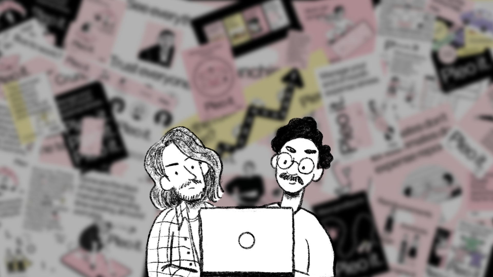
To begin, we established three main routes to explore further: rational, emotional, or character-led (or a mixture). We did our homework and gathered inspiring references, and then picked apart their pros and cons. After establishing the path we were going to follow (and therefore building some boundaries around the campaign’s approach) we were ready to start brainstorming ideas (again, easier said than done). And let me tell you, it was a storm. A week-long storm filled with post- it notes, idea generation games, jokes, and our brains feeling like mashed potatoes.
It seemed like all the routes were leading us to a phrase our customers coined and we Pleo’ers use all the time: Pleo it. Since this was the tagline from our previous campaign, we were all eager to expand on it and make it bigger since, as you probably know, Pleo is not just a company card and what’s cooler than your company name becoming a verb?.
![]()
It seemed like all the routes were leading us to a phrase our customers coined and we Pleo’ers use all the time: Pleo it. Since this was the tagline from our previous campaign, we were all eager to expand on it and make it bigger since, as you probably know, Pleo is not just a company card and what’s cooler than your company name becoming a verb?.

With the concept pinned down sitting in-between the rational and character-led routes, it was time to work closely with research and product marketing to figure out the main pain points for admins, CFOs, and finance professionals, our main target audience for our campaign (yes, like our product design peeps, sometimes brand designers can use some research as well).
The main pain point was , unsurprisingly , that these finance people spend way too much time dealing with manual processes when it comes to business spend management.
So, we have the concept and painpoints secured, now it was time then for the content team to work their magic. They accomplished this after some failed ideas and endless Google Docs. At the same time, we had been busy translating these copy ideas into different layouts as quickly as possible, to then share with the team and basically “yay or nay” them. This phase was intense and took an obscene amount of mock-ups from our side, but it’s solid proof that copywriters and designers can and should work together.
(At this point our FigJam board was having a meltdown).

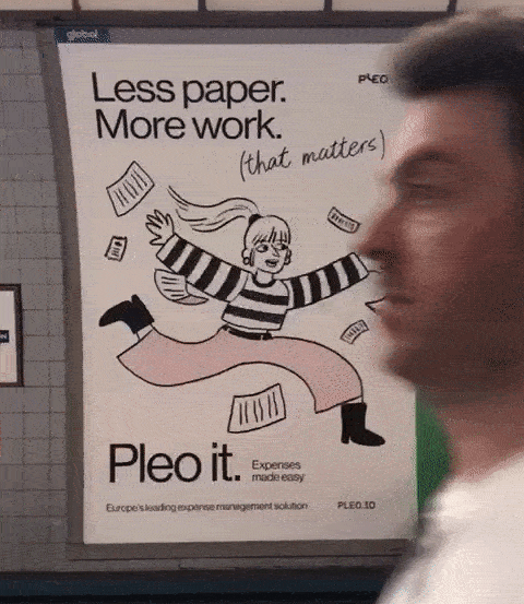
Feedback was collected, words were modified, full-stops were deleted and designs were (eventually) approved. We’d been using placeholder illustrations from our well- populated library to avoid wasting time thinking about them while working on purely layout and typography. But now it was time for me to summon my inner five-year-old child and just draw. Yes, you guessed it, lots of try-outs and iterations here as well. Lots of animals for some reason (mice and penguins that sadly didn’t make the cut) and using real Pleo’ers as models for some illustrations. (Bonus points here for allowing me to keep the pencil texture).
![]()


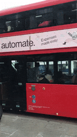
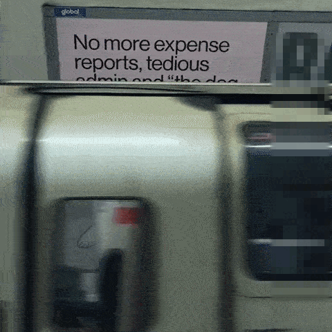
It’s been amazing to walk around London and see our designs on buses, the London Underground and Overground stations, and even National Rail stations.
I’m sure this is just the beginning, but for now, I’m very happy to have been able to spread flying papers, dogs, cats, and quirky Pleo pink characters all over the city.
Watch this space.
I’m sure this is just the beginning, but for now, I’m very happy to have been able to spread flying papers, dogs, cats, and quirky Pleo pink characters all over the city.
Watch this space.